Layout
Default
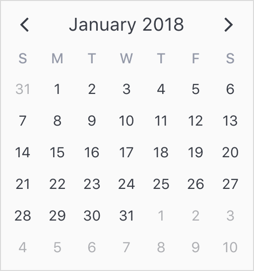
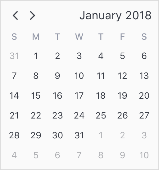
With no customization applied, v-calendar employs a single-paned, neutrally-themed design that should blend well within most web applications.
<v-calendar>
</v-calendar>
Header
Setting a custom title
The header title is a simple indicator of what month the user is currently viewing. By default, it uses the "MMMM YYYY" format. If you would like to change the display, you can provide your own format or use a custom slot. When using a custom slot, you can extract out any page properties you might need. For example, the following would display Jan '18 as the header title instead of January 2018.
<v-calendar>
  <span slot='header-title' slot-scope='{ shortMonthLabel, shortYearLabel }'>
    {{ shortMonthLabel }} `{{ shortYearLabel }}
  </span>
</v-calendar>
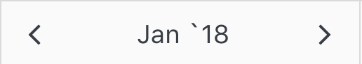
NOTE: This could more simply be acheived by using the
"MMM 'YY"format, but you get the point! :)
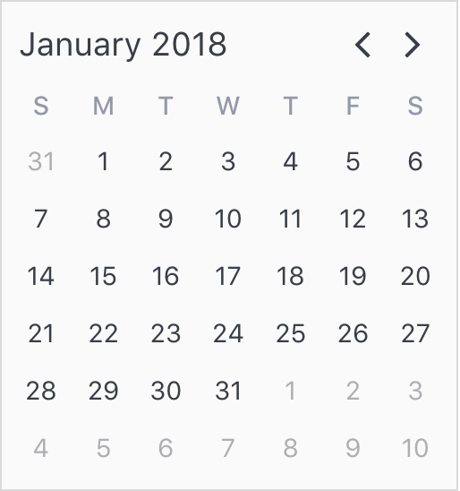
Changing the title position
The title is positioned in between the 'move previous' and 'move next' navigation buttons by default, but this is easily changed via the title-position prop, which accepts "left", "center" and "right".
Horizontal Layout
The first step to customizing v-calendar or v-date-picker is determining how the component is needs to be laid out horizontally. There are 3 critical props to determining how this is done
| Property | Type | Default Value |
|---|---|---|
is-double-paned |
Boolean | false |
pane-width |
Number | 256 // px |
is-expanded |
Boolean | false |
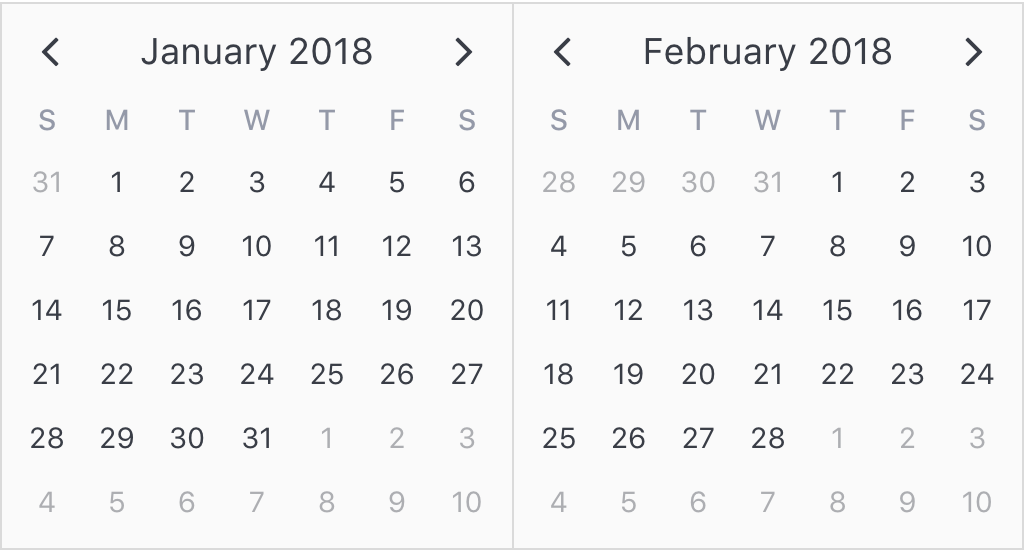
Using is-double-paned
Passing the is-double-paned prop gives the user a second pane to better explore the attributes displayed by the calendar.
Note: If the calendar is displayed in a constrained width environment (mobile device) it will revert to a single pane even if
is-double-panedhas been specified.
<v-calendar
  is-double-paned>
</v-calendar>
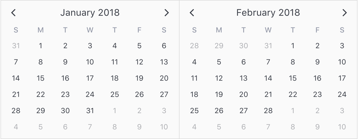
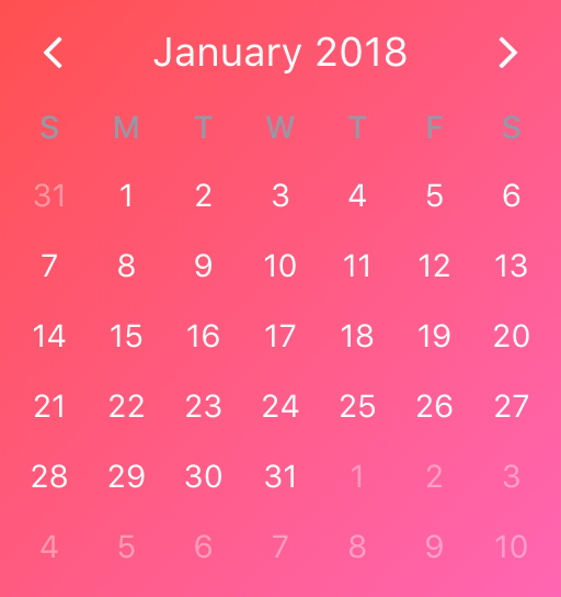
Using pane-width
The second component to the horizontal layout is the width of a single pane. This can be configured manually with the pane-width prop. Obviously, if the calendar is double-paned, then the overall width of the calendar will be double this value.
Note: If
is-doubled-panedis set and the overall screen width falls to just below the double-paned width, the calendar will revert to a single pane layout.
<v-calendar
  :pane-width='270'
  is-double-paned>
</v-calendar>
Using is-expanded
Alternatively, the calendar can automatically expand to fill the full width of its container by passing the is-expanded prop. If is-double-paned is set, both panes expand equally.
Note: The minimum width of a calendar pane is 256px, so if the container is less than 256px for single paned or 512px for double paned calendars, the calendar will overflow or get cut off, depending on the container's
overflowsetting.
<div style='width: 700px'>
  <v-calendar
    is-expanded
    is-double-paned>
  </v-calendar>
</div>
Vertical Layout & Styling
Once the horizontal layout has been determined, we can now target other methods for customizing v-calendar. This includes everything from vertical layout to subsection spacing and styling. To achieve all of this we use the theme-styles prop.
Using theme-styles
The theme-styles prop is an object that consists of various styles that can used to control the design and layout for any section of the calendar.
Here are the currently supported configurable styles.
Don't be afraid to experiment with styles! Any style you choose to configure is 'mixed in' with its associated default style, so you can target single properties without affecting the others. For example, we could target the overall wrapper width without worrying about affecting its border or backgroundColor.
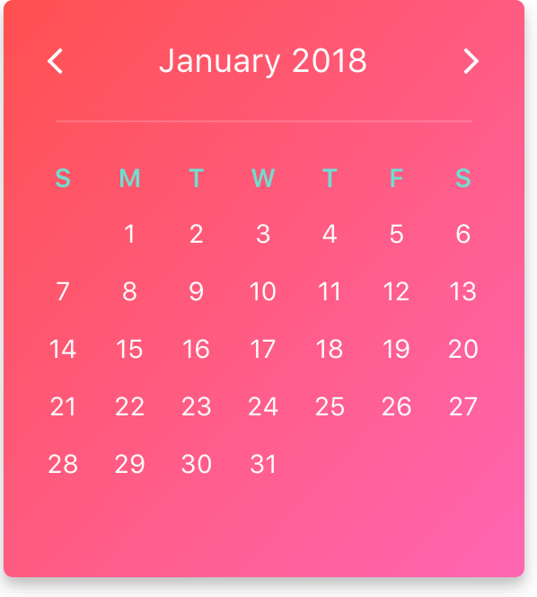
Demo Walkthrough
To explain how to use the theme-styles prop, we'll design the following calendar, walking through each step in the process, explaining which styles to use to target specific areas.
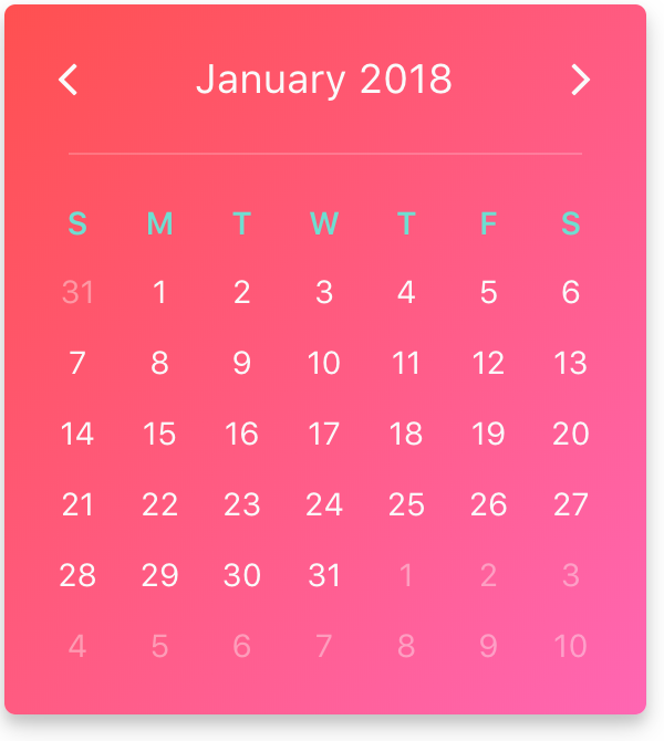
Background, Border & Shadows
First, we would like to add a nice gradient as the background coupled with a contrasting font color. To do that, we can assign a style to the wrapper like so with the desired gradient and color:
<v-calendar
  :theme-styles='themeStyles'>
</v-calendar>
export default {
  data() {
    return {
      themeStyles: {
        wrapper: {
          background: 'linear-gradient(to bottom right, #ff5050, #ff66b3)',
          color: '#fafafa'
        }
      }
    }
  }
}
Also, we can clean up the border and add a little bit of shadow to make it super fancy :).
export default {
  data() {
    return {
      themeStyles: {
        wrapper: {
          background: 'linear-gradient(to bottom right, #ff5050, #ff66b3)',
          color: '#fafafa',
          border: '0',
          borderRadius: '5px',
          boxShadow: '0 4px 8px 0 rgba(0, 0, 0, 0.14), 0 6px 20px 0 rgba(0, 0, 0, 0.13)'
        }
      }
    }
  }
}
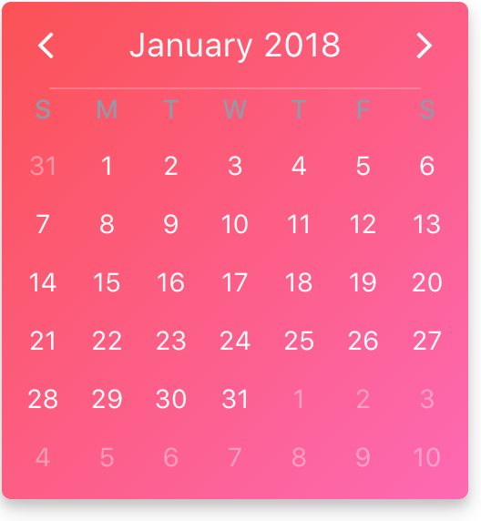
Dividers
Each calendar conveniently includes dividers that are hidden by default. They are represented by the following theme-style properties:
headerHorizontalDivider: Horizontal divider between the header and weekday sectionsweekdayHorizontalDivider: Horizontal divider between the weekday and weeks sectionsverticalDivider: Vertical divider between 2 calendar panes whenis-double-panedis setheaderVerticalDivider: OverridesverticalDividerin the header sectionweekdayVerticalDivider: OverridesverticalDividerin the weekdays sectionweeksVerticalDivider: OverridesverticalDividerin the weeks section
In our example, we just need the headerHorizontalDivider. We'll use a subtle divider that spans 80% of the calendar width.
export default {
  data() {
    return {
      themeStyles: {
        wrapper: {
          background: 'linear-gradient(to bottom right, #ff5050, #ff66b3)',
          color: '#fafafa',
          border: '0',
          borderRadius: '5px',
          boxShadow: '0 4px 8px 0 rgba(0, 0, 0, 0.14), 0 6px 20px 0 rgba(0, 0, 0, 0.13)'
        },
        headerHorizontalDivider: {
          borderTop: 'solid rgba(255, 255, 255, 0.2) 1px',
          width: '80%',
        },
      }
    }
  }
}
Well, honestly, that just doesn't look very good. It's pretty obvious that we have some spacing issues to address, which leads us into our next challenge.
Section Spacing
The sections of our calendar need some room to breathe, so we'll use the following theme-style properties to accomplish this.
headerweekdaysweeks
All we need to do is add some padding to vertically separate the sections out from each other and horizontally separate the sections from the edges. For horizontal spacing, we need to collectively apply the same padding to each section for consistency. Also note that the vertical spacing we apply to each section will contribute to the overall height of the calendar.
export default {
  data() {
    const hSpacing = '15px';
    return {
      themeStyles: {
        wrapper: {
          background: 'linear-gradient(to bottom right, #ff5050, #ff66b3)',
          color: '#fafafa',
          border: '0',
          boxShadow: '0 4px 8px 0 rgba(0, 0, 0, 0.14), 0 6px 20px 0 rgba(0, 0, 0, 0.13)',
          borderRadius: '5px',
        },
        header: {
          padding: `20px ${hSpacing}`,
        },
        headerHorizontalDivider: {
          borderTop: 'solid rgba(255, 255, 255, 0.2) 1px',
          width: '80%',
        },
        weekdays: {
          padding: `20px ${hSpacing} 5px ${hSpacing}`,
        },
        weeks: {
          padding: `0 ${hSpacing} ${hSpacing} ${hSpacing}`,
        },
      }
    }
  }
}
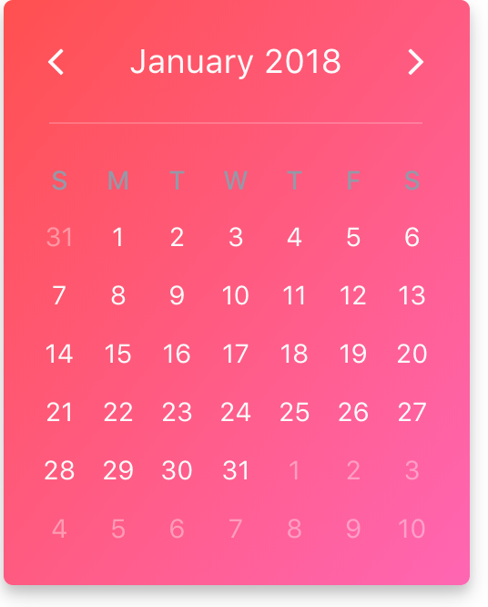
Things are starting to come together. You'll notice from the code above that hSpacing is a defined constant used to apply the same horizontal padding to all sections. One thing too is that the calendar is starting to look a little constrained width-wise, so we can go back and make it a bit wider by one of two methods:
- Assign width directly with the
pane-widthprop - Wrap
v-calendarin a container div and setis-expandedtotrue
We'll use the first approach here to make the calendar a bit wider. Remember, this is a direct prop, not part of theme-styles.
<v-calendar
  :pane-width='290'
  :theme-styles='themeStyles'>
</v-calendar>
Colors, Font
Finally, we just need to add some final touches to make the calendar a bit more legible. First, the default color (light-ish blue gray) of the weekday labels doesn't contrast well with the background gradient. Also, the day label could stand to use a tad larger font. To do all of this, we can modify the weekdays style and add a new dayContent style.
export default {
  data() {
    const hSpacing = '15px';

    return {
      themeStyles: {
        wrapper: {
          background: 'linear-gradient(to bottom right, #ff5050, #ff66b3)',
          color: '#fafafa',
          border: '0',
          boxShadow: '0 4px 8px 0 rgba(0, 0, 0, 0.14), 0 6px 20px 0 rgba(0, 0, 0, 0.13)',
          borderRadius: '5px',
        },
        header: {
          padding: `20px ${hSpacing}`,
        },
        headerHorizontalDivider: {
          borderTop: 'solid rgba(255, 255, 255, 0.2) 1px',
          width: '80%',
        },
        weekdays: {
          color: '#6eded1', // New color
          fontWeight: '600', // And bolder font weight
          padding: `20px ${hSpacing} 5px ${hSpacing}`,
        },
        weeks: {
          padding: `0 ${hSpacing} ${hSpacing} ${hSpacing}`,
        },
        dayContent: {
          fontSize: '0.9rem'
        }
      }
    }
  }
}
With that, we have completed the custom calendar design.
Days Not In Month
One final note on the styling for days not in the currently active month. These are faded by default, but you can customize the amount that these day cells are faded or hide them completely with the dayCellNotInMonth style. For example, if we wanted to hide these days completely, we could do the following:
Note: If
opacity: 0orpointerEvents: "none"are set fordayCellNotInMonth, then those day cells no longer emit mouse or pointer events.
export default {
  data() {
    return {
      themeStyles: {
        // ...all the other styles here
        dayCellNotInMonth: {
          opacity: 0,
        }
      }
    };
  }
}