Date Picker
Click here to reference the API for v-date-picker.
v-date-picker is a powerful date picker delivered with v-calendar. It is quite simply just a wrapper around v-calendar so it comes with a lot of flexibility out of the box. For example, it can accept all props supported by v-calendar and emits all of the same events. By default, it displays the picker in a popover for an input element (which can be replaced with its default slot) but can display inline by setting the is-inline prop.
It actually just uses attributes under the hood to represent date selections (specifically a highlight and content style) but these attributes are completely customizable. For example, you could change the date selection to dots instead of a highlight if that makes more sense for your application. Also, it takes advantage of native v-calendar events to update the selected and dragged values when day cells are clicked or dragged over, respectively.
Selection Modes
v-date-picker can be configured to operate in 3 different selection modes via the mode prop.
- Single Date (
mode = "single") - Multiple Date (
mode = "multiple") - Date Range (
mode = "range")
Single Date
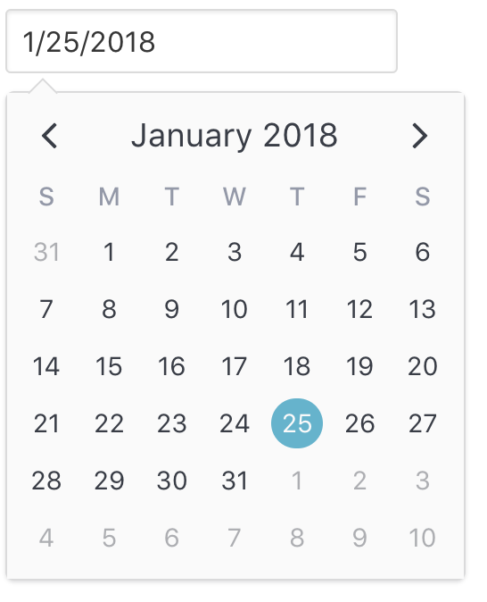
The first and most common mode is single date selection. It uses a native Javascript Date object for its internal value, and the value can be cleared by setting the value to null. This is the default mode, so it can be omitted if desired:
<v-date-picker
  v-model='myDate'>
</v-date-picker>
export default {
  data() {
    return {
      myDate: new Date(2018, 0, 25) // Jan 25th, 2018
    }
  }
}

Multiple Dates
The second mode is multiple date selection. It uses an array of Date objects for its internal value state. The selected value can be cleared by setting the value to null or an empty array [].
<v-date-picker
  mode='multiple'
  v-model='myDates'>
</v-date-picker>
export default {
  data() {
    return {
      myDates: [
        new Date(2018, 0, 1), // Jan 1st, 2018
        new Date(2018, 0, 15) // Jan 15th, 2018
        new Date(2018, 0, 29) // Jan 29th, 2018
      ]
    }
  }
}
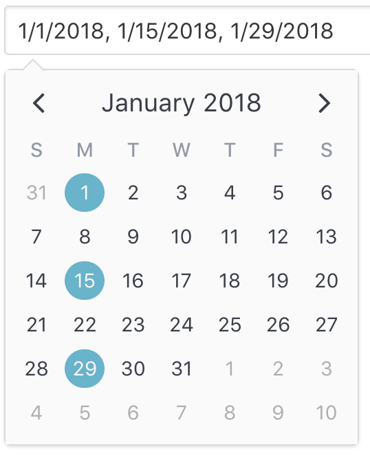
When used as a popover (is-inline is false), the user may enter dates in the input element as a list of comma separated date values. Each date is parsed using the parser specified by the date-parser prop function. If the user clears out the input text, the value is set to null. Read this to learn how to configure the input element.
Date Range
The third mode is date range selection. It uses an object consisting of optional start and end dates. The selected value can be cleared by setting the value to null. Using an empty object { } for the value is equivalent to a range with infinite start and end dates.
<v-date-picker
  mode='range'
  v-model='myRange'
  show-caps>
</v-date-picker>
export default {
  data() {
    return {
      myRange: {
        start: new Date(2018, 0, 16), // Jan 16th, 2018
        end: new Date(2018, 0, 19)    // Jan 19th, 2018
      }
    }
  }
}
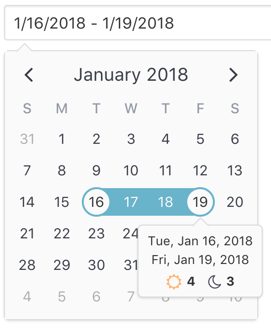
You can see how the default popover for the range selection displays the currently selected (or dragged) start date and end date with indicators showing the length of the day and night spans. As expected, this popover can also be configured to your own slot or component.
How To
Below are guides to performing common tasks with v-date-picker.
Format & Parse Dates
Please reference the formatting & parsing section of the README for steps to customizing the input element's formatting and parsing behavior.
Set Min/Max Dates
Set min and max dates by assigning their respective props.
<v-date-picker
  v-model='myDate'
  :min-date='new Date(2018, 0, 1)'
  :max-date='new Date(2018, 0, 31)'>
</v-date-picker>
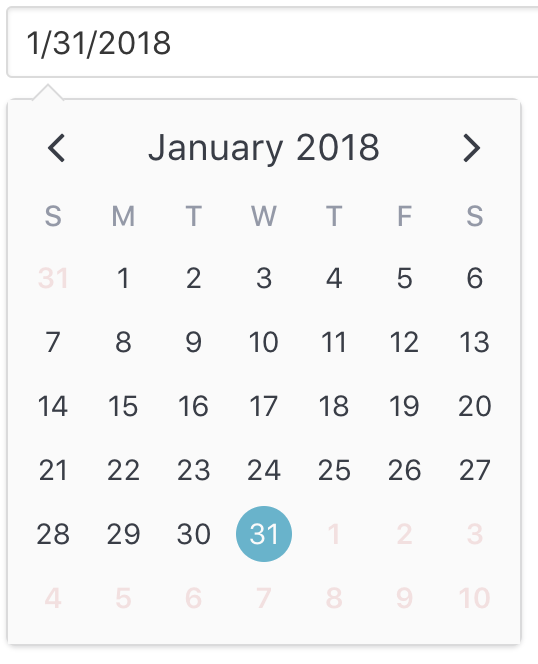
These props are implemented under the hood by modifying the disabled-dates prop. Note, though, that you can still use the disabled-dates prop while still using the min-date and max-date props. They are simply provided for convenience sake.
Disable Dates & Patterns
Sometimes you need more control than simply disabling minimum and maximum dates. That is where disabled-dates and available-dates come in handy.
The best way to understand them is to understand that disabled dates in general for v-date-picker are implemented using, you guessed it, an attribute. There is a disabled-attribute (which you can customize) that simply uses disabled-dates for its dates expression and available-dates for its exclude-dates expression. So, to understand how they work, you simply need to understand the rules for configuring dates with attributes.
Let's consider the previous example of setting a min and max dates. Suppose we would also like to disable the weekends. Here is how that would look.
<v-date-picker
  v-model='myDate'
  :min-date='new Date(2018, 0, 1)'
  :max-date='new Date(2018, 0, 31)'
  :disabled-dates='{ weekdays: [1, 7] }'>
</v-date-picker>
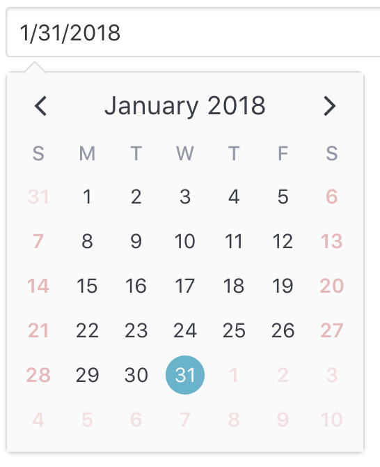
Require Selected Date
There are 3 ways to clear a selected date (value = null).
- Assign
nulltovalueprop or to local state variable that is bound to usingv-model - User toggles selected dates by clicking them on the calendar (only valid when
modeis"single"or"multiple") - User clears the input element text and commits the change by pressing the
enterkey or changing focus (blurevent)
You can prevent methods 2 and 3 by setting the is-required prop to true.
Note: This effectively prevents the user from clearing the value. The developer can still clear it via method 1.
Customize Input Element
Note: The following applies for date pickers in popover mode (
is-inline === false)
There are 2 ways to customize the input element for v-date-picker
- Apply props for styling and behavior to the built in
inputelement. - Provide your own custom slot to use for the
inputelement or omit it entirely.
Using input-props
By default, v-date-picker leaves the input element as a bare element with no attributes applied. However, it is very easy to apply your own classes, styling, readonly behavior, placeholder and more by using the input-props prop. This is an object you can use to configure the element as if you configuring it directly.
Here, we assign a Bulma class, a placeholder and make the input readonly so the user has to select a date via the calendar.
<v-date-picker
  v-model='myDate'
  :input-props='{ class: "input", placeholder: "Please enter your birthday", readonly: true }'>
</v-date-picker>
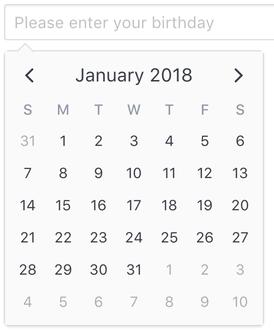
Using Custom Slot
If you would like a more customized experience, you can use a custom slot to use as a trigger for the date picker popover element. For example, perhaps you would like to use a custom form component or include a button to clear the input value.
Here are the steps to utilize this approach.
- Create a custom slot within
v-date-picker. You don't have to name it, as we'll be using the default slot. Be sure to extract out the following props by usingslot-scope, when needed:
| Prop | Description |
|---|---|
inputValue |
The formatted value to bind to your own input element. |
updateValue |
Function that appropriately updates the value with your accepted value at the time of your choosing. |
- Bind the
inputValueto your input value. - Call
updateValue(*newValue*, *options*)to correctly update and validate a string or data value, depending on what constraints are currently applied (disabled-dates,available-dates,min-date,max-date). This function also accepts an optional second object parameter with the following properties:
| Property | Description | Default Value |
|---|---|---|
formatInput |
If new value is valid, date picker should reformat the inputValue (based on formats.input). |
true |
hidePopover |
If new value is valid, date picker should hide popover. | !popoverKeepVisibleOnInput |
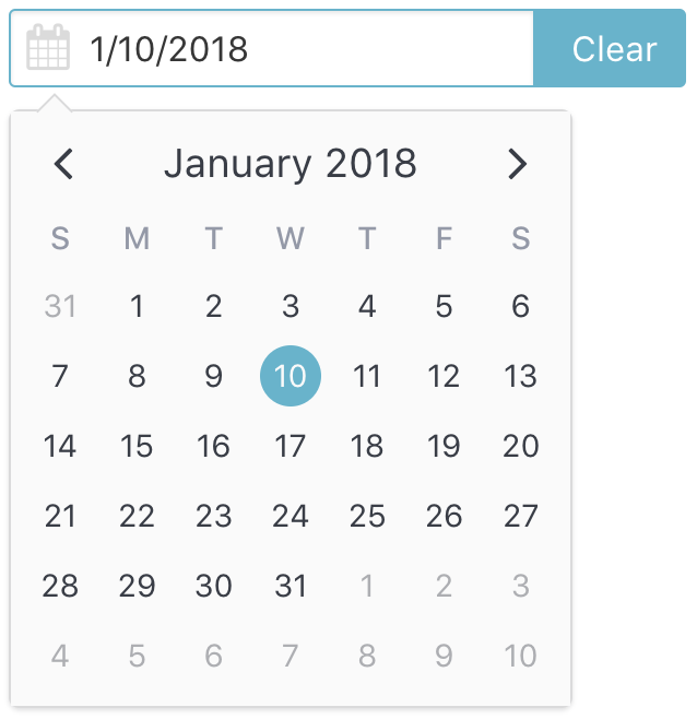
Here is an example using custom components from Buefy and a Clear button to clear out the date.
<template>
  <v-date-picker
    v-model='selectedValue'
    is-expanded>
    <b-field
      :type='inputState.type'
      slot-scope='{ inputValue, updateValue }'>
      <b-input
        type='text'
        icon='calendar'
        :value='inputValue'
        :placeholder='inputState.message'
        @change.native='updateValue($event.target.value)'
        expanded>
      </b-input>
      <p
        class='control'
        v-if='selectedValue'>
        <a
          :class='["button", inputState.type]'
          @click='selectedValue = null'>
          Clear
        </a>
      </p>
    </b-field>
  </v-date-picker>
</template>
export default {
  data() {
    return {
      selectedValue: null,
    };
  },
  computed: {
    inputState() {
      if (!this.selectedValue) {
        return {
          type: 'is-danger',
          message: 'Date required.',
        };
      }
      return {
        type: 'is-primary',
        message: '',
      };
    },
  },
};
Update As You Type
When using the built-in input, you can set the update-on-input prop.
<v-date-picker
  v-model='myDate'
  :update-on-input>
</v-date-picker>
For custom slots, call updateValue on the input event, whilst making sure to set formatInput = false:
<v-date-picker
  v-model='myDate'>
  <input
    type='text'
    slot-scope='{ inputValue, updateValue }'
    :value='inputValue'
    @input='updateValue($event.target.value, { formatInput: false, hidePopover: false })'
    @change='updateValue($event.target.value, { formatInput: true, hidePopover: false })'>
</v-date-picker>
Hide popover on escape
By default, when using the built-in input the popover hides when the escape key is pressed.
For custom slots, call updateValue on the keyup.esc event, whilst making sure to pass in the desired value and set hidePopover = false:
<v-date-picker
  v-model='myDate'>
  <input
    type='text'
    slot-scope='{ inputValue, updateValue }'
    :value='inputValue'
    @input='updateValue($event.target.value, { formatInput: false, hidePopover: false })'
    @change='updateValue($event.target.value, { formatInput: true, hidePopover: false })'
    @keyup.esc='updateValue(myDate, { formatInput: true, hidePopover: true })'>
</v-date-picker>
Customize Attributes
v-date-picker uses the following properties to properly display and validate date selections:
| Attribute | Description |
|---|---|
tint-color |
Color of the selected attribute and drag attribute (with opacity: 0.5 for drag). Overridden by select-attribute and drag-attribute if specified. |
select-attribute |
Attribute used to represent the selected value. |
drag-attribute |
Attribute used to represent the dragged value. Valid only when mode === "range". |
disabled-attribute |
Attribute used to represent disabled days. |
The tint-color prop is a convenience prop for just changing the select and drag colors without having to worry about configuring the select-attribute and drag-attribute props themselves. The select-attribute and drag-attribute props, however, override tint-color as they are used for more detailed configuration of the attributes.
To customize these attributes, we just need to provide our own custom attributes objects. Any attributes we provide will replace the default ones.
Note: Attribute keys are automatically assigned for us (
"drag-select"for theselect-attributeanddrag-attribute, "disabled" fordisabled-attribute). Thedisabled-attributeis also assigned anorderof100, so it can take precedence over the others.
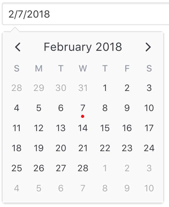
For example, say we want to use a dot instead of a highlight to denote the selected date. All we would need to do is pass a new select-attribute:
<v-date-picker
  v-model='myDate'
  :select-attribute='myAttribute'>
</v-date-picker>
export default {
  data() {
    return {
      myDate: null,
      myAttribute: {
        dot: {
          backgroundColor: 'red'
        }
      }
    }
  }
}
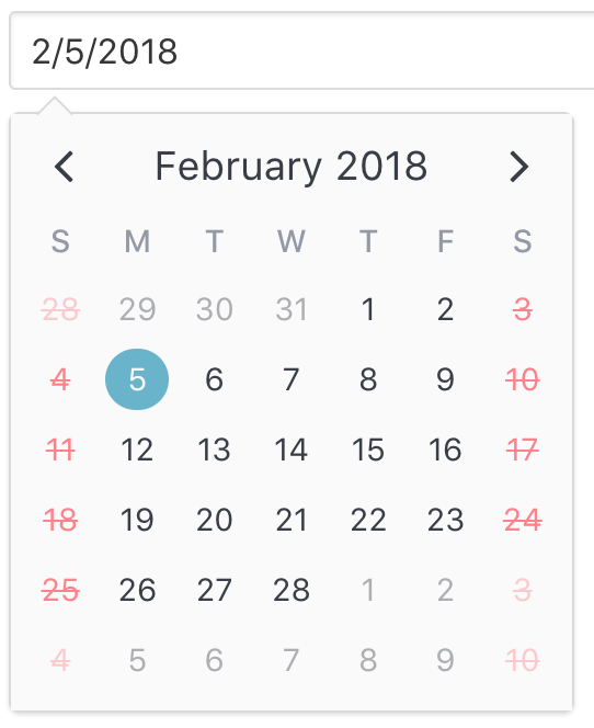
Or if we want disabled dates to display a line-through the days...
<v-date-picker
  v-model='myDate'
  :disabled-attribute='disabledAttribute'>
</v-date-picker>
export default {
  data() {
    return {
      myDate: null,
      disabledAttribute: {
        contentStyle: {
          color: 'red',
          textDecoration: 'line-through',
          opacity: 0.5
        },
        // We need to override the default `dayContentHover` theme style set by `v-date-picker`
        contentHoverStyle: {
          cursor: 'default',
          backgroundColor: 'transparent',
        },
      }
    }
  }
}
Customize Selection Popover
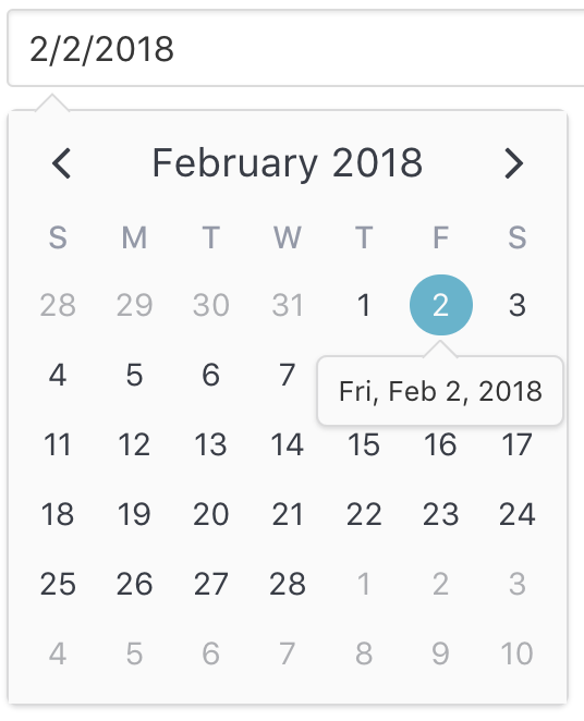
When the user makes a date selection, a default popover is shown that
- Displays the selected day when
mode === "single" || mode === "multiple"
- Displays the start date, end date, day and night spans when
mode === "range"
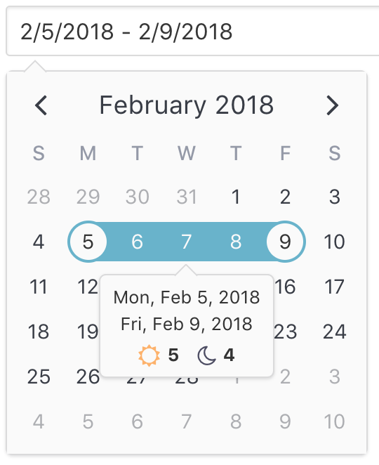
If you would like to provide your own popover, you can do so by configuring the popover object for the select-attribute and/or the drag-attribute to display your own custom component (often, a single file component).
Note: Configuring the popover using
slotsis not currently supported becausev-date-pickerdoes not pass down slots intov-calendar.
In fact, you can see how v-date-picker configures its own popover component by referencing the steps for using a custom component as a popover content row.
Show Clear Margin
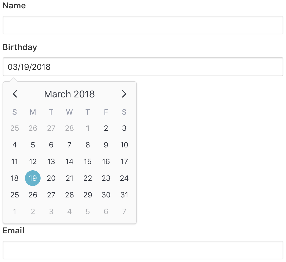
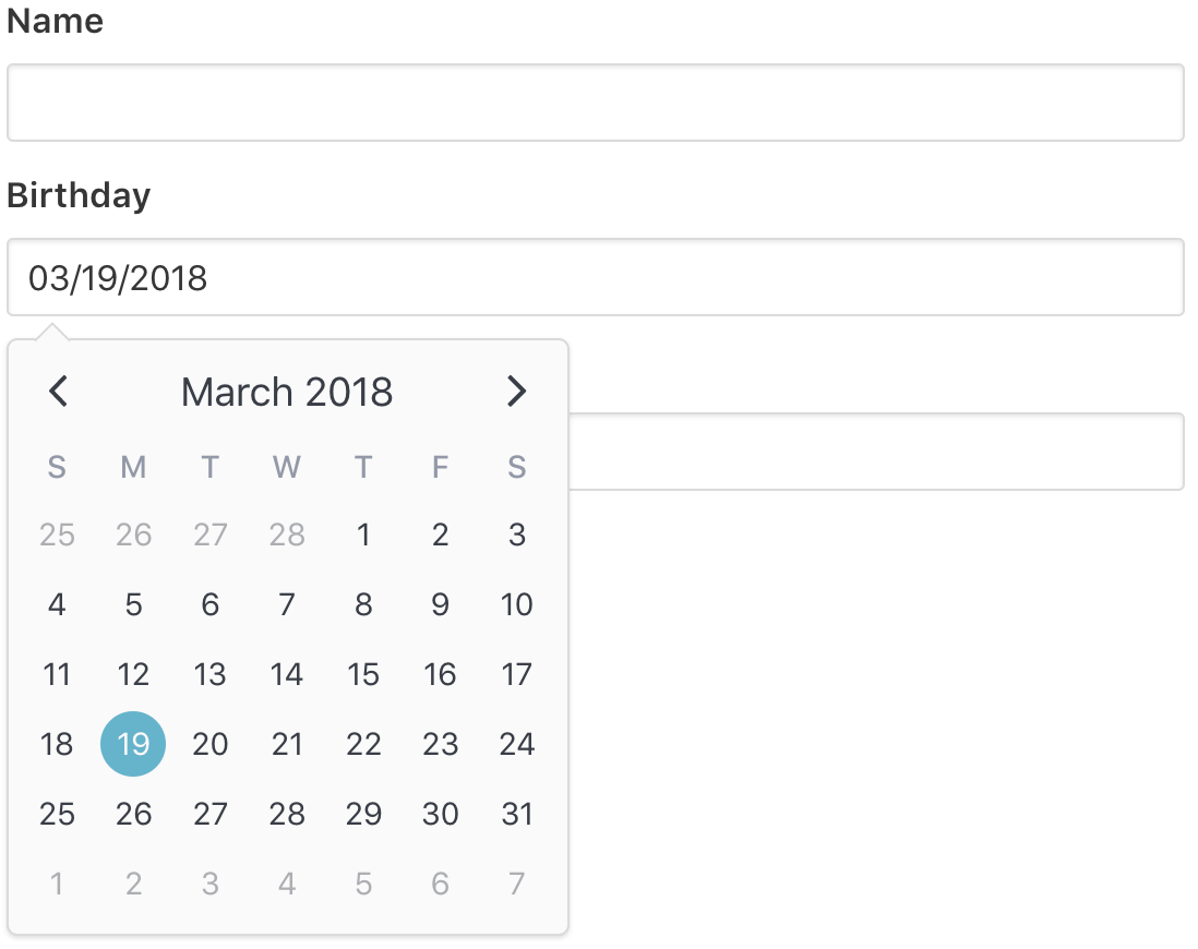
When v-date-picker appears as a popover, anything below it is covered because of its absolute positioning. If you would like to automatically apply a margin equal to the height of the popover calendar whenever it appears, set popover-show-clear-margin to true.
Without Clear Margin
<div class='field'>
  <label class='label'>
    Name
  </label>
  <div class='control'>
    <input class='input'>
  </div>
</div>
<div class='field'>
  <label class='label'>
    Birthday
  </label>
  <div class='control'>
    <v-date-picker
      v-model='date'>
    </v-date-picker>
  </div>
</div>
<div class='field'>
  <label class='label'>
    Email
  </label>
  <div class='control'>
    <input class='input' type='email'>
  </div>
</div>
With Clear Margin
<div class='field'>
  <label class='label'>
    Name
  </label>
  <div class='control'>
    <input class='input'>
  </div>
</div>
<div class='field'>
  <label class='label'>
    Birthday
  </label>
  <div class='control'>
    <v-date-picker
      v-model='date'
      popover-show-clear-margin>
    </v-date-picker>
  </div>
</div>
<div class='field'>
  <label class='label'>
    Email
  </label>
  <div class='control'>
    <input class='input' type='email'>
  </div>
</div>
